Reading Your Data with Intelligence, Part 2: How to Visualise Data
The first article in this series briefly explains what we mean by business intelligence (BI) and how it can serve travel organisations. This article focuses more on how to analyse and visualise data, especially XML data in the online travel industry, before taking a closer look at the dashboard in the final article.
Analysing XML data streams that flow between sales channels, intermediaries and suppliers, being able to extract business intelligence from the analysis and then using the insight gained in daily operations is a powerful way of adding real value to many of the revenue impacting areas of online travel.
Key revenue impacting areas include:
– Understanding demand for travel products and how demand is responded to
– Identifying inventory shortfalls in time to do something about it
– Monitoring look-to-book rates and by which agent,
– Identifying areas of potential revenue leakage and stemming the flow
– Understanding revenue and margin contribution
– Tracking cancelations and their impact
– Incentivising and rewarding loyalty
– Responding to any server or network degradation in real-time
– Tracking and reporting errors in the message flow
Like with many other industries and BI applications, the range of analysis that can be carried out on data and the many ways it can be served up for consumption to data consumers (i.e. decision-makers) can be overwhelming. To avoid frustration or confusion about what the data actually means, it is important to have clear objectives for the type of analysis needed and how it is presented. Below is a quick gallop through some of the different ways of visualising data.
This article doesn’t discuss how you get the data, but focuses on how it can be visualised and used to tell the stories with charts and graphs that help to identify what’s driving searches and bookings and performance. We also try and cover some real-world examples of how travel companies can use the data to create reports with the ability to drill down or show high-level trends and dynamic at-a-glance dashboards enabling readers to digest information easily.
Presenting data for clarity
Most of us are wired for learning and understanding with visuals. Very few people can examine data tables and pick out trends or grasp big-picture issues. Even statisticians and data scientists who are better equipped than most to deal with data in all its forms benefit from graphical presentations. The ultimate goal of data visualisation is to present a story, highlight what’s important and provide answers to questions. Below is a quick overview of some of the key ways of presenting data.
Tables are very powerful when dealing with a relatively small number of data points. Essentially tables are designed to show us the numbers, the whole numbers and nothing but the numbers. They show labels and amounts in the most structured and organised fashion and reveal their full potential when combined with the ability to sort and filter the data. However, when you have lots of data, and online travel comes in huge quantities, tables alone are not good at spelling out clear messages in easy to read formats. This is where charts help out considerably.
Charts or graphs help people understand data quickly by simplifying volume and complexity. They are all about showing the inter-connections in your data points. Whether you want to make a comparison, show a relationship, or highlight a trend charts can do the job more quickly. And there are few different types that we use to show the XML analysed data off to best effect:
Analysing the millions of messages in real-time can provide managers in key revenue driving areas with meaningful insights. For example:
Some concrete examples of enticing ancillaries could be:
– Line charts are especially suited for showing trends over time. Line charts emphasise time flow and rate of change rather than the amount of change. Line graphs are particularly useful for identifying patterns and trends in the data such as seasonal effects, large changes and turning points.
– Bar charts are one of the most commonly used types of graph and are a way of summarising a set of categorical data. It displays the data using a number of bars of the same width, each of which representing a particular category. They show relationships between similar data across time for example. The height of the bar represents the measured value or frequency: The higher or longer the bar, the greater the value. Bar charts can be quite flexible and if there are multiple categories they can be stacked and differentiated using a colour codenagers want to understand the dynamics of the competitive distribution landscape and be able to recognise quickly which channel/product mixes deliver the best returns.
– Pie Charts are round charts that use “pie slices” to show relative sizes of data usually in percentage terms. The entire pie represents the total data set and each segment of the pie is a particular category within the whole. Although impressive, these charts in general are really only suited to a small number of categories as they bring to visual life data that might otherwise be presented as a simple table. Booking by continent could be one example or Agent sales by product. The optimum categories is usually between 6 and 10.
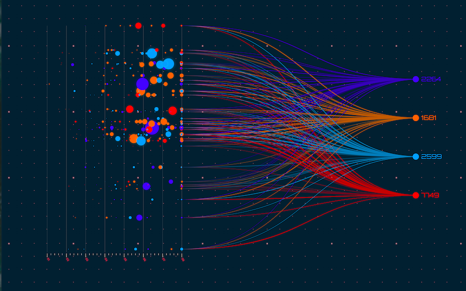
– Scatter graph is simply a set of data points plotted on an x and y axis to show the relationship between two sets of data. The shape those data points create reveals the correlation in a large amount of data. Unlike other charts, scatter plots have the ability to show trends, clusters, patterns, and relationships in a cloud of data points—so the outliers or abnormal points can be spotted at a glance. An outlier is a basically a data point that is significantly far away from the majority of the data, and one that bucks the expected trend, either positively [i.e. the best performer] or negatively (i.e. the worst performer). Such a graph can be quite useful in determining agent performance and in particular those delivering high value bookings with a low book-to-look ratio, or those piling on the search hits but with few bookings to show for it.
– Heatmaps use colour to communicate relationships between data values that would be much harder to understand if presented numerically in a spreadsheet. Heat maps have gained importance in the new era of big data. While in the past scatter plots were used on smaller datasets to discover trends and outliers that remain hidden on traditional charts and spreadsheets, heat maps are used to easily identify find clusters where there is a high concentration of activity, indicated by the depth of the colour. This could be useful in identifying for example which destinations are most popular with agents at any given time.
Digging deeper with laser sharp focus
A raw data table is not always easy to decipher at a glance, but when we plot this information in a bar, line, pie or scatter chart, trends and key insights become immediately apparent. The trick now is to make sense of the data available in order to draw conclusions that can help drive business profits (the reason why everyone is in business!). Business intelligence used to be the domain of specialists, but today’s BI tools, such as the analytics platform from Triometric, make it easier to empower key users across different departments with the skills they need to perform their own data analyses and get explanations for why certain results occurred.
This involves the production of analytic reports that allow users to drill-down, slice and dice and filter data to get answers to business questions. These analytic reports allow users to dynamically adjust key trends such as time period, products, regions, etc. so that data can be explored and analysed in a variety of different ways.
So what does it mean to dig deeper:
– Drill Down helps the user go from a more general view of the data to a more specific one at the click of a mouse. Drill down gives the user a deeper insight of the data by letting him peel back the layers to see what makes up the figures he’s analysing. Drilling down is essentially changing the resolution of the dimension like a lens taking focus. Once the resolution has dropped, more information from a part of the dimension becomes visible. For example let us consider time as one of the dimensions when we are looking at bookings we can look through the lens of a year, a quarter, a month or a day, or even an hour or part of an hour. Each level gives us a partial view over the period. Further drill downs can lead us to bookings over a certain time period by hotel name or code, room type, revenue, agent or any other relevant item.
– Slicing and Dicing — while you can drill to look at information at any level, you can slice and dice to select the exact information you want in your report and eliminate the data which is not necessary for the current analysis. For example if we are interested in analysis of bookings during a particular month, week or day then we can drill down to the particular time dimension and then slice the cube for the particular period that we are interested in. Essentially, slicing and dicing is to break a body of information down into smaller parts so that it can be analysed from different angles and can be better understood. The cooking analogy is a good one for visualising what is happening to the information. In data analysis terms, reducing information in this way makes it easier to analyse or observe in isolation.
– Data Filtering — data sources can be quite large or include unnecessary data to answer a query, so reports can be built allowing filters to be set to refine the data to just the relevant bits to meet the query conditions. For example, rather than get information about all customers, you can create filters to select customers in a certain region or only those buying a certain product, or meeting certain criteria. It is also possible to specify filters in a report meaning that users can adopt a more self-service approach to getting the reports they need. In other words reports created by users in order to establish facts or patterns.
The dynamic nature of this kind of report generation allows users to make real-time changes and to see data the way it benefits them most. They can also make modifications and save reports for reuse whenever needed. For many reports, data can be exported into other applications, such as spreadsheet tools, for additional ad-hoc analysis. The data vision is immediate and not a rear mirror view – so taking action resulting from the data can have immediate impact too.
A million hits and a mountain of data as people browse the web for hotel rooms, flights, holidays and more. Exploring this treasure trove of data for the insights that drive profitable business decision is no mean task. Enter data analytics and in particular XML search and booking analysis to dig deep and create order out of chaos. Search and booking data is the vital ingredient travel companies should be harnessing for success.
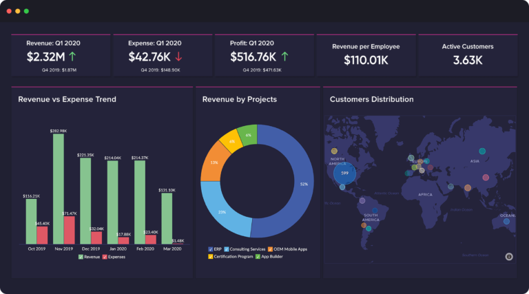
Business analyses takes the form of individual reports, such as any of the flavours mentioned above. The key metrics that a company cares most about can also be collected together in a dashboard that lets decision makers monitor many metrics at once. Glancing at the dashboard it is possible to quickly check the health of the systems or see interesting and noteworthy correlations in the data.
The next article wraps up this series by taking a closer look at the real-time dashboard and why you should have one when analysing data such as XML message streams or monitoring web server environments.


